aquasale
A PINCH OF THE SOUTH THROUGH RELAUNCH
The sea salt brand Aquasale is popular. It not only offers sea salt for every day and occasion, but also brings lightness and the Mediterranean Sea into everyday cooking. Taking everyday life not so seriously, being spontaneous and experiencing how delicious light-heartedness tastes – this newly developed positioning is represented in all areas of the brand presence.
Disciplines
Digital
Packaging
Year
2019
Agency Areas
ADD LIVELINESS TO FOOD WITH AQUASALE
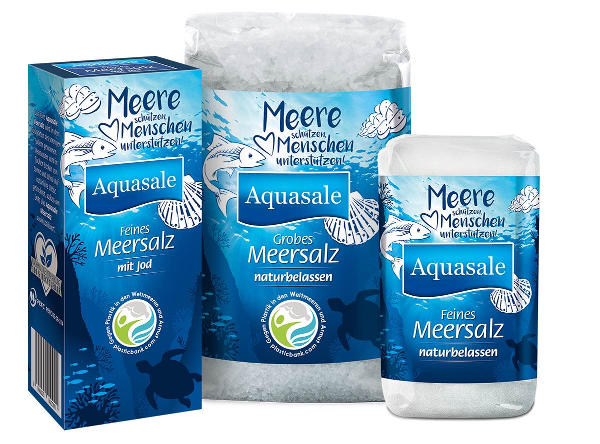
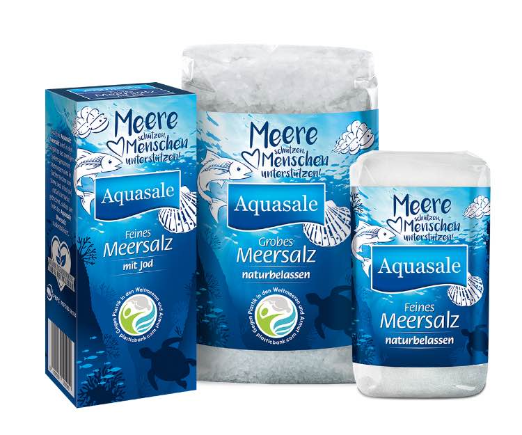
The diverse sea salt products bring the authentic and uncomplicated mentality of the Mediterranean on to the plate. The new key visual and the fresh headline style make it clear in all print motifs: Aquasale is a pinch of light-heartedness, joy and togetherness.
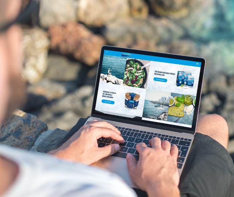
AN ONLINE EXPERIENCE THAT FUELS THE APPETITE
AN ONLINE EXPERIENCE THAT FUELS THE APPETITE
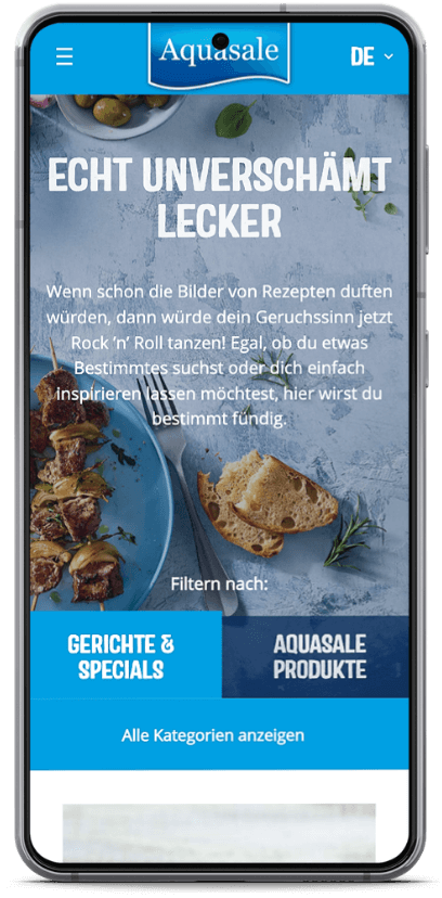
The new website delivers what the brand positioning promises. It is Mediterranean, emotional and modern, the copys are approachable, relaxed and sympathetically cheeky. The innovative navigation uses the hamburger icon, which is mainly known from mobile surfing. Elegant, subtle cinemagraphs set special highlights in the key visual and above the footer.
With a click on the menu, all subpages appear at a glance.
Images are large and visually appealing across the entire width of the page. Generously designed tiles invite you into the various subpages.

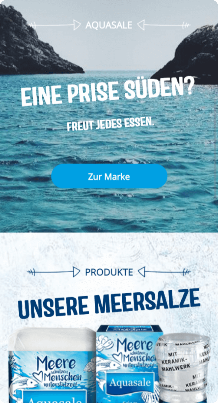
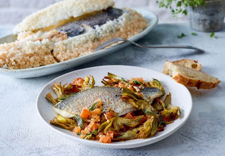
Information about the brand, the products or a specific recipe can be accessed with just a few clicks. Not only the dishes themselves, but also the activating and appealing recipe filter spark inspiration. Linking recipes and products creates added value — a tasty tour for the eyes and tongue! The revised packaging design also matches the fresh digital presence.

